Why traditional menus are (and always will be) better than ribbons or "command bar"s.
Early menus
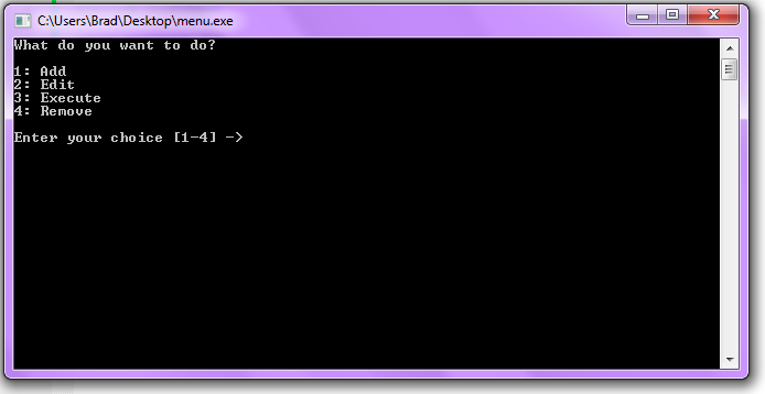
The idea behind a menu is to provide an easy way to see a list of all the relevant commands. Since early computers used a command-line interface (CLI) early menus were very limited. The individual menu options were outputted to the screen, usually with a associated letter or number, and the user would then be prompted for the letter or number that corresponded for the option they wanted.
This, in stark contrast to the programs which required users to memorize keyboard shortcuts and millions of optional (or non-optional) parameters, made command-line based programs much more usable.
However, CLI-based menus could only go so far. Most command-line based systems of the time did not have mice. It was the norm to not have a mouse, in fact, because there wasn't much to point at.
Some menu systems implemented a way by which the keyboard could be used to interact with the menu system, but this was still very primitive. And with upcoming systems like the Apple Lisa and Xerox Star now using pointing devices and graphical user interfaces, a new system needed to be devised.
Graphical Menus
The graphical menu was made basically out of necessity. Since users now had something to click with conversely there must be something to click on.
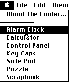
The user is presented with a verb-noun list of potential options. You would click on the verb (for example, File), and be presented with a list of potential actions.
It is simple, and easy to use.
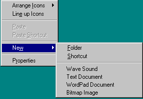
Under many operating systems, right-clicking an object or otherwise interacting with some part of the screen opens up what is called a context menu, aptly named because the features it provided depended upon which part of the GUI was interacted with.
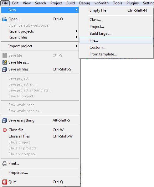
Many graphical menus have what are called sub-menus, which contain additional options that belong to one single noun-based operation. For example, as shown here, a new menu option could have a sub-menu indicating which type of file was to be created.
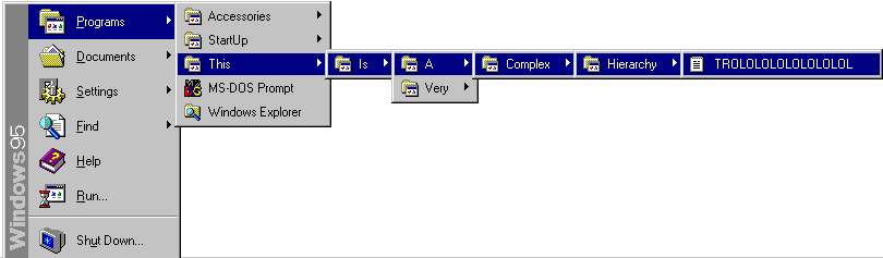
One very unfortunate pitfall of menus was the potential to have very complex and long hierarchies. And if you selected the wrong one you would have to go back and find the right one, which could also sometimes be difficult.

Windows Vista and later (this is Windows 7) in the Microsoft Windows family address this potential problem by having a different way of browsing the programs menu. However it is still quite possible to have big hierarchies to look through.
All in all, however, these new graphical menus are very robust and easy to use. It is not difficult to learn how to use them and it is quite difficult to forget. Plus, they provide a very simple set of GUI tools for arranging similar options.
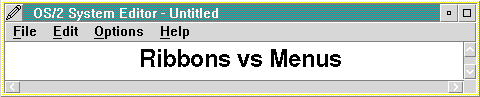
The Office 2007 "Ribbon"
Because they are Microsoft, Office 2007 came out with this new gem of a design flaw: the "ribbon" UI.
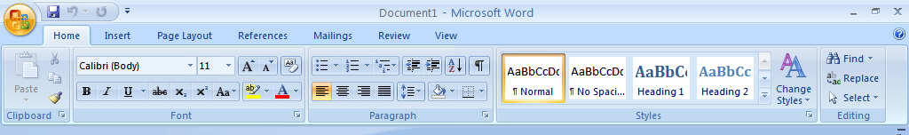
The ribbon, or as Microsoft puts it "The Fluent UI", is basically nothing more than a modernized tabbed toolbar. Gone are the File, View, Format, etc. menus, and now all the functions have been thrown together into various tabs. Most of the common features under the File and Edit menus are now under "Home", plus a few of the insert and format options as well.
Tabbed toolbars are not new. Allaire's now-discontinued HomeSite used what was called a "tabbed toolbar", as did IBM's Lotus eSuite.
The problem with Microsoft's implementation here is that it comes 11 years after the last major change to Office (Office 97, the prior "milestone"). People were used to the old way of doing things, and as such this new system will take a long time to get used to.
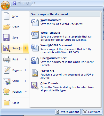
There is still a menu in the ribbon. But it is not labeled with anything useful (just the Office logo), and all it contains are file options (which should be in the ribbon, IMO) and a few program options. Every single feature is buried somewhere in the ribbon.

Shrinking the ribbon down completely changes the way it looks. This is a no-no, as a constantly changing UI can very easily confuse users.
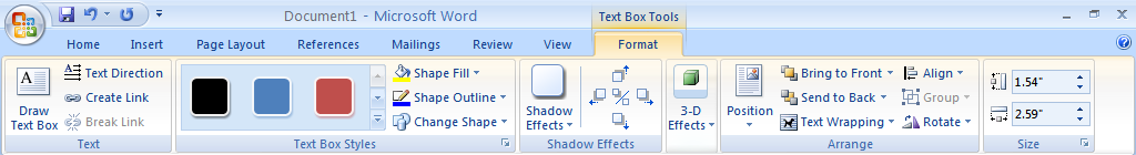
Speaking of a changing UI and confusing users, various graphics and items result in a new tab on the ribbon being displayed, instead of the more traditional toolbar. In some cases a toolbar may also appear, resulting in UI inconsistency.
Some other various downfalls I also found:
- The reason the ribbon exists is to be rid of the complicated hierarchies menus have. Unfortunately ribbons can be just as complicated.
- In theory, they would be great for programs that didn't work with files. The irony here is that most of Office deals with files.
- Too much information is crammed into one space, which can lead to confusion.
- The text labels don't line up properly in a lot of cases, making a quick scan of the features while looking for the one you want practically impossible.
- The English reading standard, vertically speaking, is from top to bottom. Thus the group labels would make more sense if placed at the top, not the bottom, as a result.
- Icons are used instead of text in alot of places. Most of the icons used don't do a good job conveying their meaning, which is a huge problem.
- The tooltips display very slowly.
- The fact remains that Office is the only program (up until Windows 7) that uses the ribbon UI. Everything else still uses menus, which means that now BOTH systems have to be learned and memorized.
What a gigantic nightmare...
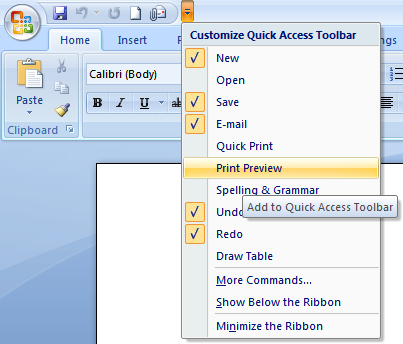
Yes, it is possible to create custom shortcuts. There are a few problems with this as well:
- The icons are placed in the title bar, where the WINDOW TITLE should go.
- The shortcuts use icons only, and once again most of the icons don't convey their purpose very well.
- Supporting someone over the phone becomes really difficult as now the way each user uses the program can very well be completely different.
Overall, the ribbon UI has no technical advantages over traditional menus, it can be confusing to use, and it makes program support incredibly difficult.
IMHO the real reason behind the ribbon was to make money off their training partners, since everyone needed to be re-trained for this new system.
Ribbons in Windows 7/8
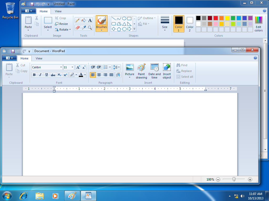
Keeping with the usual Microsoft tradition of being unable to admit they made a mistake in redesigning the UI, Windows 7 introduces a major facelift to Paint and Wordpad, which features our old friend, the ribbon UI.
What a mess. The ribbon is completely inappropriate for simple applications like Paint or Wordpad, and as a result there is way too much unused space over the ribbon. Wasteful.

Shrinking the program window still results in a cluttered mess (not that it wasn't a cluttered mess already).
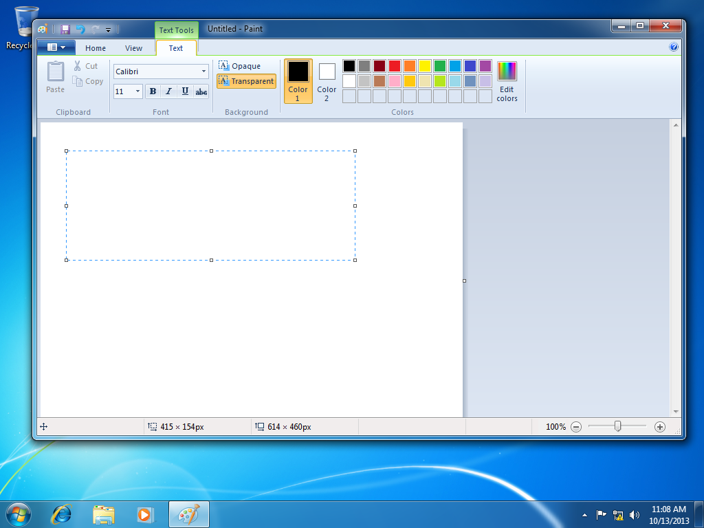
The UI is still permitted to constantly change whenever some new graphic or object is added to a drawing. Yuck, I liked the toolbars better.
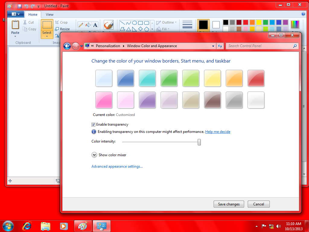
One other huge flaw: you can have the ribbon in any color, as long as it's blue. Or in other words, unless a high-contrast theme is selected, the ribbon does not conform at all to system color preferences, resulting in UI inconsistency.
And speaking of UI inconsistency, Microsoft could have gone the full nine yards and replaced all the UIs with ribbons, however they did not. So now you have applications with ribbons and applications with toolbars, and you require the user to memorize both systems.
"Simple"? Yeah, right. Maybe in an attempt to "simplify" Windows further they will do away with the individual languages and just offer Windows and Office and whatnot in a single Microsoft-bastardized "extended" version of Esperanto? They will make money off of their training partners in that case too!
Oh, but it gets worse...
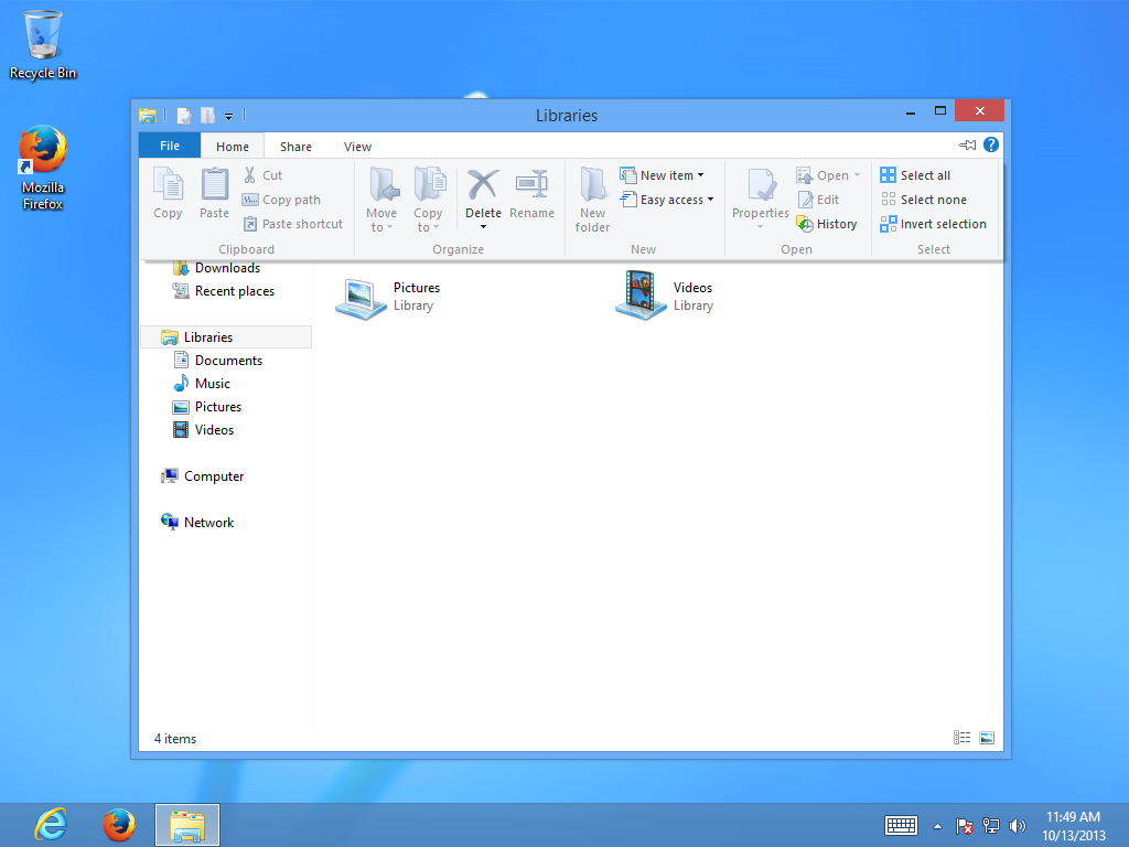
Ignoring Windows 8's other problems, here is something that really blows. This is the new "command bar" found in the Explorer. It is essentially a ribbon that tries to emulate drop-down menus. What a joke.
As for simplifying things? This "command bar" trash joins the traditional ribbon and even more traditional menus in terms of UIs in Windows, bringing the count of UIs the user needs to memorize up to three...
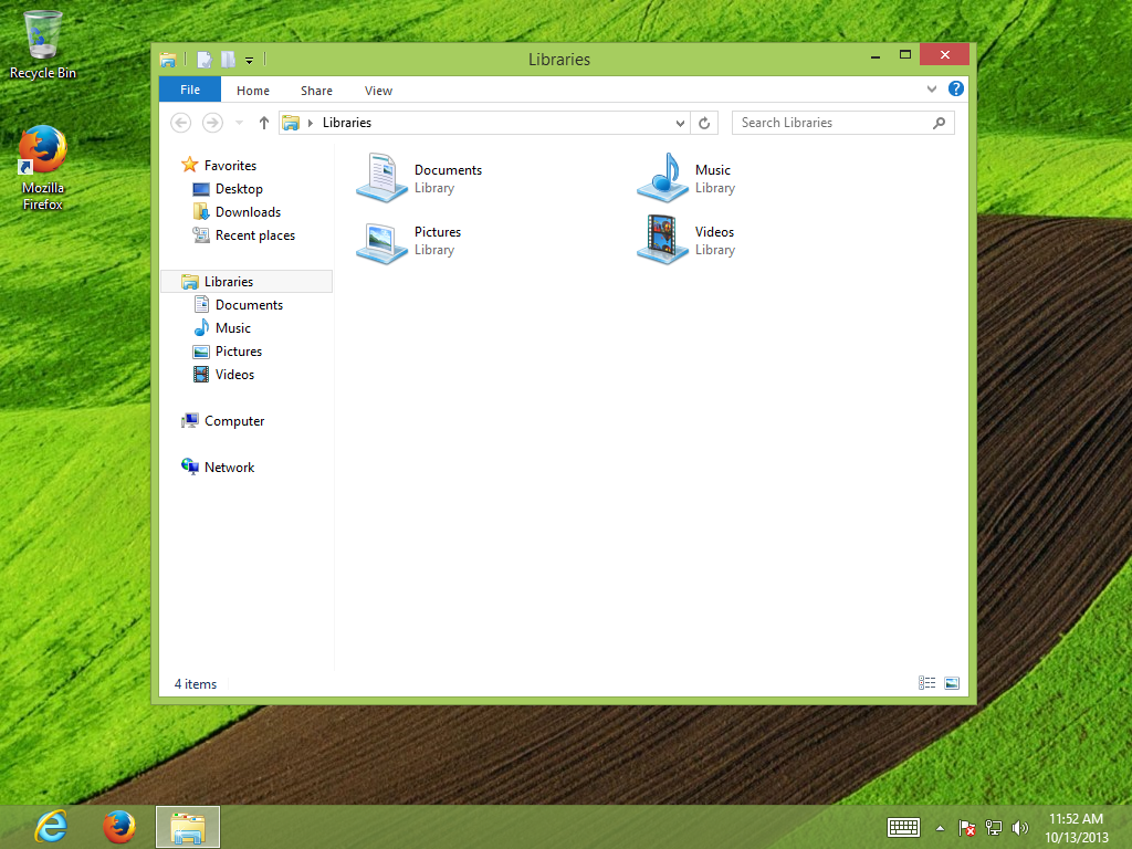 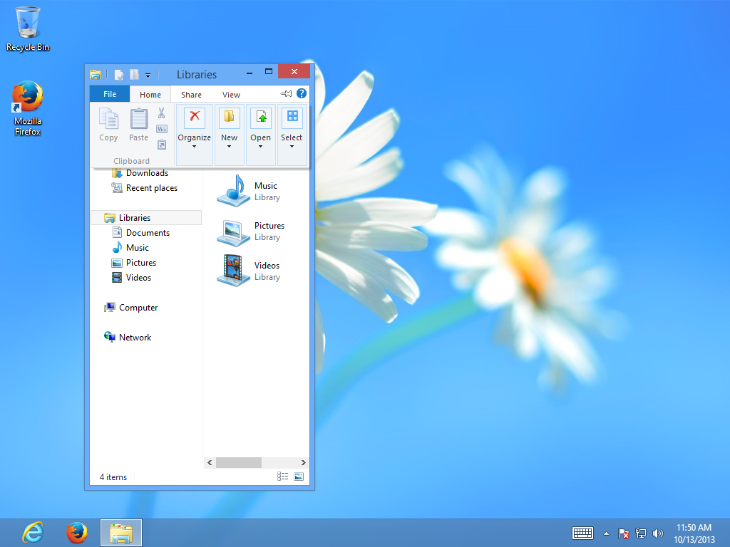
And, of course, Microsoft still cannot get the little things right. The command bar fails to conform to system colors, and it still changes based on what is selected and how big the window is.
Conclusion:
Ribbons and command bars are grossly inappropriate user interfaces for the programs they are being used for, and ribbons/command bars are incredibly inefficient and difficult for a beginner to use. Not to mention Microsoft has handled it incorrectly by bundling many different UIs in one package. Put bluntly, ribbons suck ass, and there is not a force on this planet that can change that opinion. |