|
Windows 10 is here.
Actually, Windows 10 has been out for a while now, since last summer. But, with the return of GUI Central, I have decided that now is a good time to take a look at it.
Going from Microsoft's page (from the Wayback Machine since apparently the original got hosed at some point, probably to cover up the marketing BS) about it, it is the "best Windows ever", the "Windows you know, only better", "millions of people are already using Windows 10", so on and so forth.
Is it any of these? Well, there are certainly new and great features about it, it certainly brings together old pieces of Windows (although not in the best way, but more on that later), but is it really "the best", or even better than prior versions of Windows?
Well, let's "start" with the fact that the splash and login screens have remained basically unchanged (no screenshots because I don't want to have to figure out how to screenshoot them).
The login screen is horrible. I've already explained why in my Windows 8 rant. That it hasn't changed in three years is really pathetic and shows that Microsoft doesn't care. It still gives no indication as to what the user is supposed to do at such a screen. But hey, everyone has a touch screen these days, right?
Microsoft tries to make it more difficult to use a local user account with Windows 10, but fortunately you can still do so (if you happen to want to do so).
I'll tell you one thing right now: all those claims that Windows 10 is faster? False. All of them, just all false. It hasn't mattered what system or configuration I've run it on, the performance "improvement" is either completely negligeable, non-existent, or it is in fact slower...by a large margin!
I'd also like to point out that I had to reboot the virtual machine these screenshots were taken in. The first time I started, it had no idea I had a mouse on the system. Despite it working just fine the last time I used it, and after a reboot...buggy? I think so. Why such a thing is even miraculously a problem in 2015 (now 2016!) is beyond me.
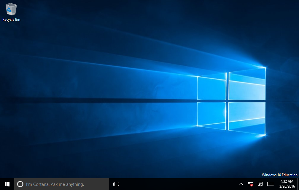
Moving along, here's the desktop.
Not much has really changed here, it still has that Windows 8 style flat appearance. I don't miss Aero at all, but I really feel like the default theme is seriously dull and boring. Is that really what computers are? Maybe it is, I have no idea, but to someone just getting their first computer, maybe not.
The first thing you'll notice is that intrusive "Cortana" thing right beside the start button. We'll get into that in a minute. Other than this, and the radically flattened icons now present on both the desktop and in the notification area, there's nothing different between this and Windows 8.1
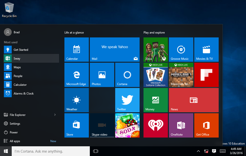
Here is the "new" start menu. It's supposed to combine the best of the old Windows 7 menu and the Windows 8 start "page".
Couple of problems. First of which being that it is horribly inefficient with screen space. There is no reason to have all of those flashy massive tiles blinking various bits of information in the user's face by default. I get you can turn it off, but that's not the point. Some of the more important things, like news and weather, I can understand, but XBox Live? Get real.
In Windows 7 (and with Classic Shell on Windows 8 and 8.1), the start menu loaded very fast. On Windows 10, it does not. So, there's that I guess.
I found the way some of the various options are layed out to be a bit confusing. Why are the user's login options separate from the shutdown controls? Why does the File Explorer get a dedicated menu and nothing else does? Why is it not obvious that "Power" is a menu? I also guarantee you I've never used any of the applications listed under "Most used", and the few that I have used aren't even there.

What used to be "all programs" or "all apps" is now this. It's got to be the worst laid-out thing I've seen in a while. With Windows 7, you had nicely grouped programs, such as "accessories", "games", etc. With this, you have a billion Metro apps thrown into your face, a few other random other system things, AND groups! Plus advertisements for other Microsoft programs. Where have I heard of this before?
Oh, not to mention it can only take up that tiny portion of the menu, the rest is still taken up by those pointless tiles. Why?
If this is supposed to be "simpler" than the all apps screen in Windows 8, it's not. At all. Sorry. |