|
Sticking to their usual release schedule, Microsoft has now released their latest version of Windows, Windows 8 (called such despite it still only being NT 6.2).
In theory Windows 8 should be the greatest thing since Windows 95 of 20 years prior. It is supposed to run on even the slowest of hardware, it will support more hardware, and it is supposed to be easier to use.
In reality, wow does Windows 8 ever blow.
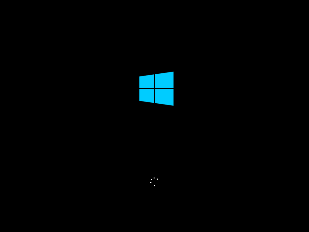
This is the new splash screen. Completely simplified, and now with the new monotonic Windows logo. I liked the old logo better.
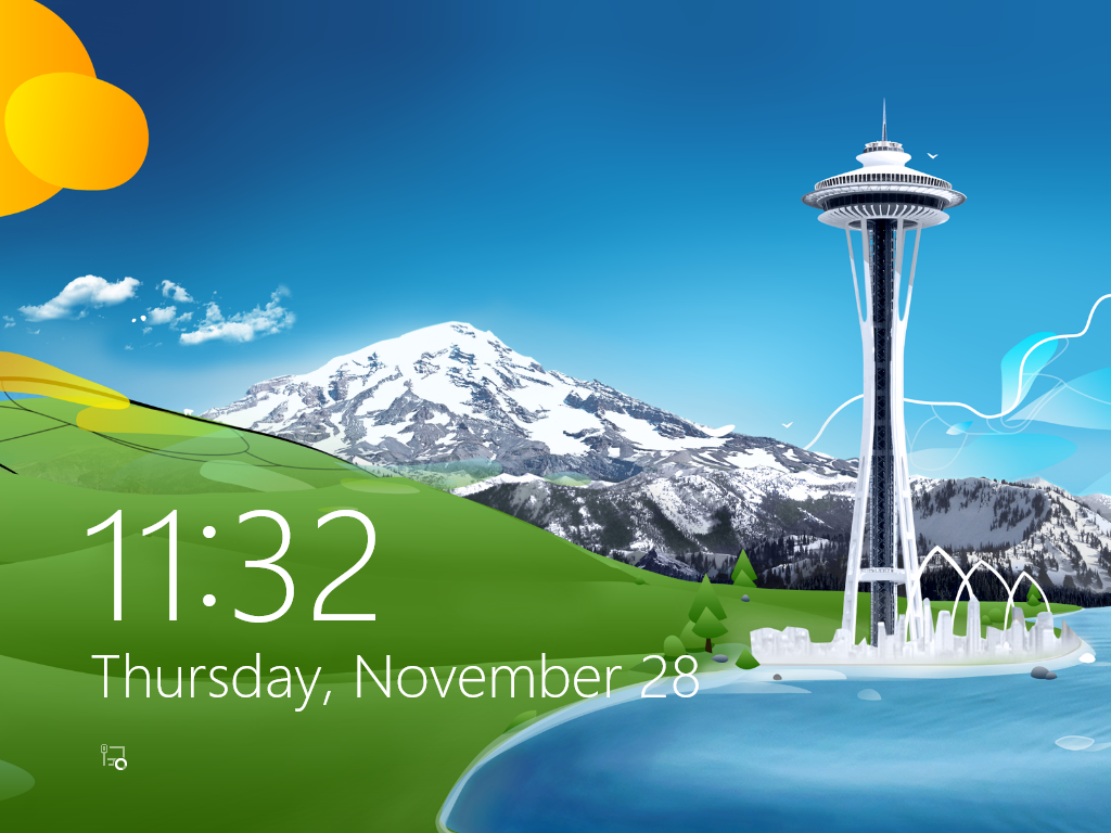
Logging in has been completely changed. Instead of being directly greeted by the login prompt, you now have this thing called the "lock screen".
"Simple to use"? Pah! Why does this even exist? This is something you would see on a mobile operating system, more proof that MS cares more about their tablets and phone than they do the desktop.
On a phone users would be used to something like this, since phones have had this for years. On a desktop, which likely does not even have a touch screen, it completely fails to convey it's purpose or any next steps. All a user sees is a fancy graphic with the time and some icons. Nothing indicating what is going on, or that you need to click on it to proceed, and thus a user would be left there waiting for instructions or for something else to happen.
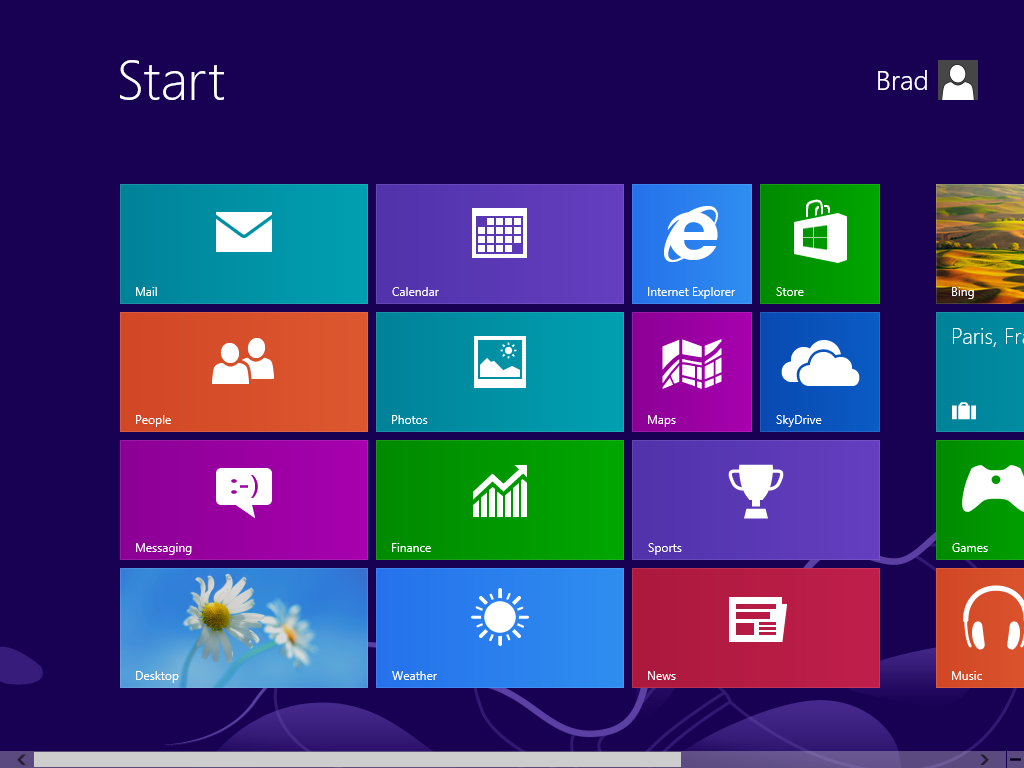
After logging in, you are greeted with the new Metro start screen.
WHAT THE CRAP KIND OF UI IS THIS?!?
Let's see if we can spot all the problems here:
- It scrolls horizontally.
- There are no visible controls for doing anything except opening applications.
- There are no windows. Why would you call it "Windows" if there aren't even any windows in it!
- The "tiles" are huge.
- It is literally all advertising a Microsoft service.
It's fairly obvious that Microsoft didn't care.
On the more relevant side of things, this new start screen basically consists of tiles for full-screen apps that fly about as you scroll (horizontally) through them. While it is fairly obviously possible to use a mouse, it is also fairly obvious that it was intended to be used with a touch screen.
Alot of people have been rappeting on about how modern and new and shiny and great touch screens are. I hate to crash your party, but there is nothing new about touch input:
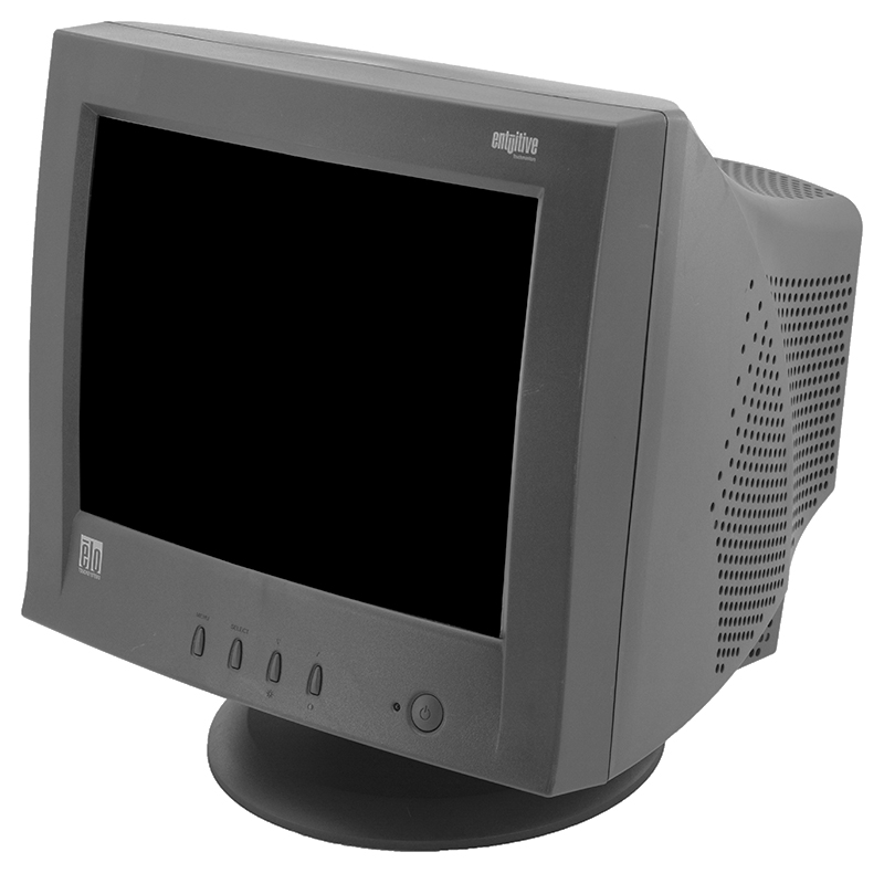
See that? That is a CRT with touch input built-in. Those have been around since amber monochrome CRTs back in the 1980s, and other forms of touch input have existed for just as long.
Now why did they not take off for everyday desktop use? Here are a few reasons:
- It has been proven that your arms will tire while operating a vertical touch surface for a while.
- To manufacture a device (especially way back when these were bleeding edge) with a touch input method is obscenely expensive. Thus that makes the purchase of such a device obscenely expensive. For phones and tablets it doesn't matter since those have smaller displays, but a 31" touch screen? Are you kidding me?
- Touch devices don't perform better than ordinary displays, thus invalidating any justification for paying the price (unless you just want to be like all the cool kids, which doesn't justify it but whatever).
- It will look like crap after five seconds since all touch screens have glossy surfaces. They attract dust, dirt, foreign particles, and fingerprints, and are impossible to clean properly.
And anyways, anyone caught putting their fingers on my monitor pays for a professional cleaning service. |