|
Home
Site News BeOS/Haiku Deskmate Linux/UNIX Apple II Mac OS NeXT ReactOS GEOS GEM QNX OS/2 RISC OS Windows Windows Shells Xerox/Sun Others Office Ribbon |
You are here: Firealarms Main > GUICentral > Windows > Windows 11 > Page 3 of 7 |
|
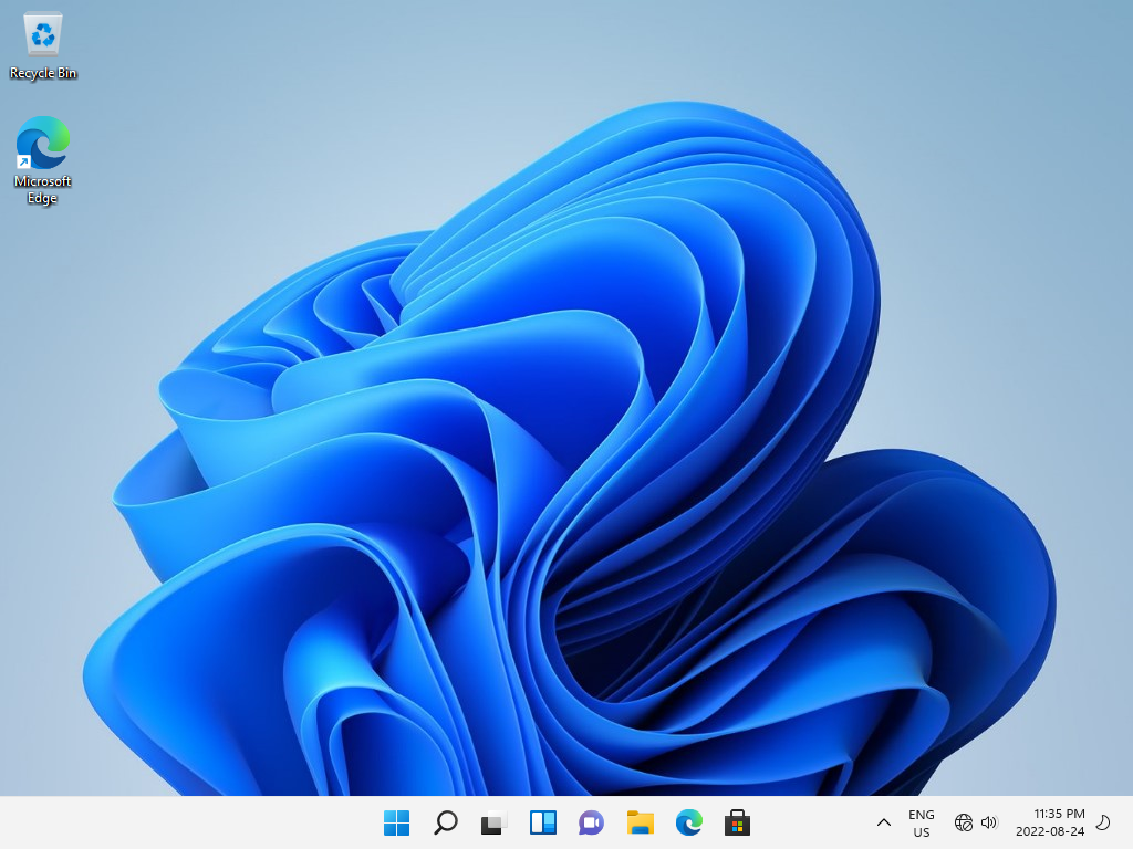
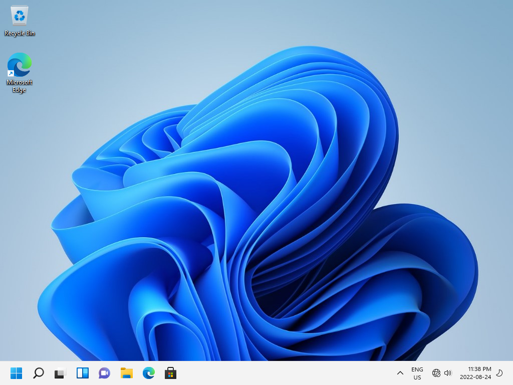
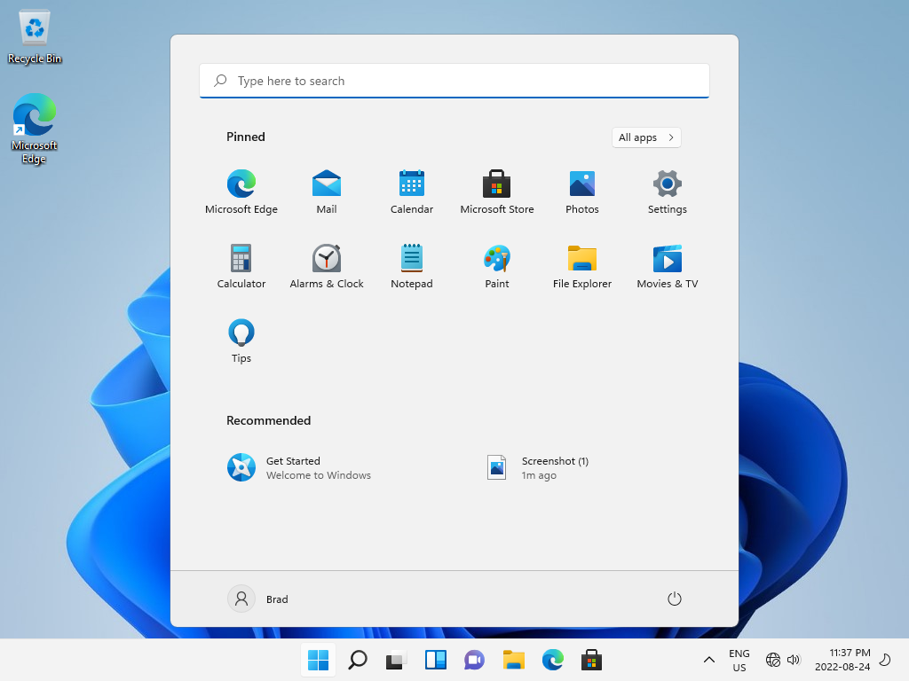
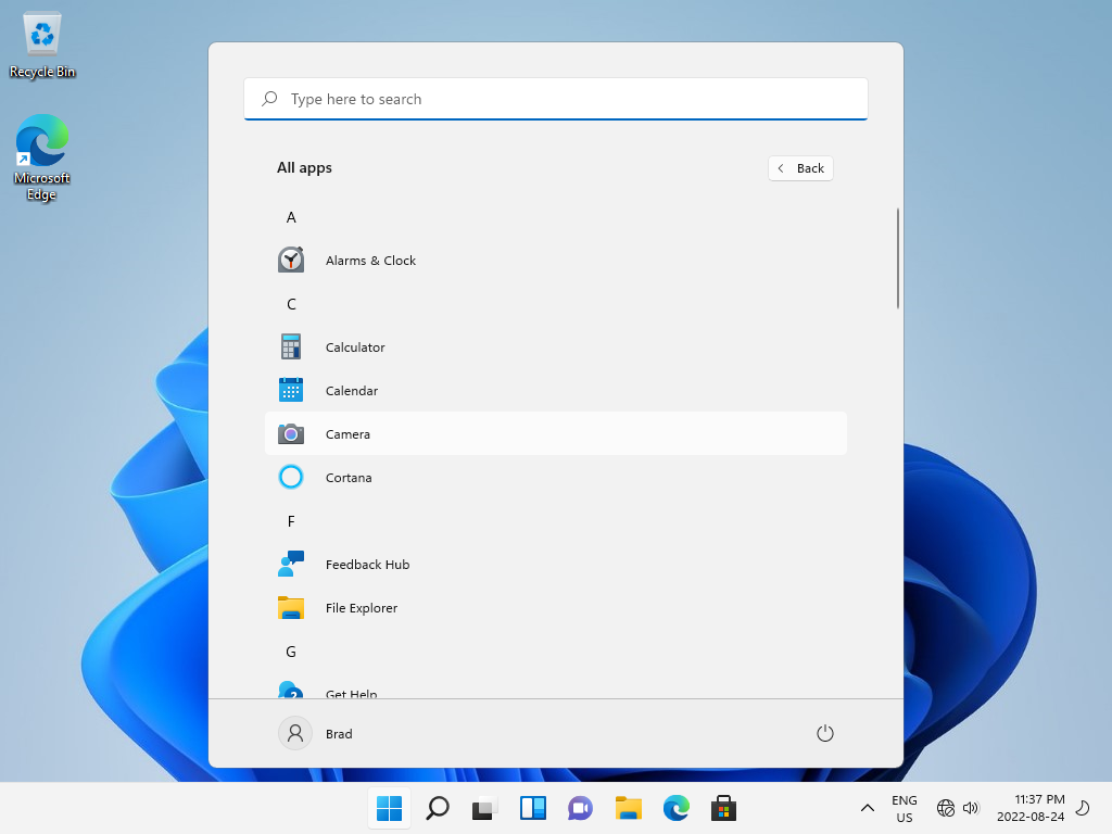
Obviously the biggest change is the new center-alignment of the start menu and main taskbar area. I suppose this is done to cater to people with theater screens for monitors, since that's popular these days. It may also have been done because the Mac OS has a center-aligned Dock, but M$ is about 20 years too late to that party. It's also worth noting that the colours were brightened significantly, and it appears Windows now defaults to a light theme. I guess they got tired of catering to a generation of emo teenagers. Or realized that particular fad died in the '90s.
|
|